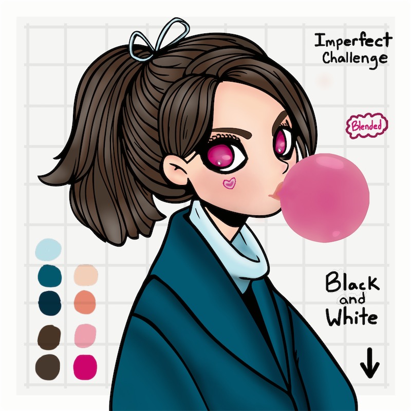
#3 of 6 picture for the Imperfect challenge hosted by 🌼 Art by Sam 🌼 aka 🌼 Samantha Joy 🌼.
This is the fully blended version!
If you compare #1 and #2, you can see where the details were added.
You can also compare #1 and #3 (this picture) to see the effects that adding depth gives to a picture.
Njjwc716
1 year ago
Gotcha
MelodyB
1 year ago
Lovely job
Kitty Snow 🕊✝️🙏🏼
1 year ago
Beautiful job!! What a difference!! 💞♥️💞
SockChi
1 year ago
@Kitty Snow 🕊✝️🙏🏼
Thank you for your support!!
The difference is kinda crazy!
That’s why I really wanted that before and after picture.
💙MyKidsRLife💜
1 year ago
@SockChi what is your tip for people just learning to blend?
SockChi
1 year ago
@💙MyKidsRLife💜
That’s a good question!
I think a lot depends on the style you are going for and taking a look at the picture from a distance.
I like more subtle effects.
Personally, I like to do a rough one pass on everything and then adding more as I see necessary.
This means I might put one line with the soft brush and then look at that section before possibly adding a little more. Then I’ll move to another section.
I will pretend I’m done and look at how it effected everything as a whole.
SockChi
1 year ago
@💙MyKidsRLife💜
When I say pretend I’m done, I mean I will click the little green check mark at the top right and view it from a distance. The green mark takes you to the page where you can choose to add effects and such. I’ll figure out if I like what I see and then I will go back into the picture.
At this point, I decide if I need more of that same color or a different shade of it.
If I use a different shade, I will usually put it a little on top and below the part I’m working on.
SockChi
1 year ago
@💙MyKidsRLife💜
Ex: Hair
Let’s say the base color of the hair is red. I added white highlights but think something is still off.
I might use orange or yellow and partially overlap some of the white and add some on the red.
SockChi
1 year ago
@💙MyKidsRLife💜
I usually pre plan main colors and main highlights. From there it depends on how I feel about what I did.
Overall:
I typically start light with blending. Do a quick pass and then check. Add more colors if necessary. I typically use colors within a similar range.
The love birds one I did over a week ago has black with red highlights.
Don’t be afraid to match different colors with highlights.
SockChi
1 year ago
@💙MyKidsRLife💜
Part of my pre planning involves areas I know I want darker or lighter.
I base mine on lighting in the scene and ripples in cloths.
The more you test out placement of the highlights the more you will be able to get an idea of your style for blending.
I really recommend the distance looking though!
I’ll be zoomed in at a section and check it quickly to see if I like the change I made. Then I’ll go back into the picture, I’m still be zoomed into that spot. Fix/keep at that point.
SockChi
1 year ago
@💙MyKidsRLife💜
I highly recommend layering when blending. Especially for a subtle look.
If there are 5 wooden strips placed next to each other, you want to gradually bring the colors up the the intensity of the main one.
White to black is an easier concept.
One side is pure black (1) and the other is pure white (5). Dead middle, it’s gray (3)(50-50 ratio). That means 2 will have a 75% black and 4 will have a 75% white.
It helps lead the eye for a subtle look
💙MyKidsRLife💜
1 year ago
@SockChi You make it look so easy and effortless! But the distance looking is a good idea! I never thought of looking at it like that. I still struggle with what colors go where and cause what effect, and sometimes blending seems more of a curse for me than anything. I haven't always been the best at adding depth and effect. I know what I want my final product to be but have a hard time making it come to life on the canvas. I watch you and a few others and it is just so . .
💙MyKidsRLife💜
1 year ago
@SockChi gorgeous!! But the. I try to recreate it and while I know it will be my style and not the exact same I still feel they fall short of what I wanted. I have trashed so many because I just get frustrated.
But I love to color so I always come back. Thank you for the insight. I will be referring back to this one my next attempt!!
SockChi
1 year ago
@💙MyKidsRLife💜
I have actually spend a decent amount of time around art in a round about way. I studied animation and learned visual effects. It’s not something that is learned over night but with time.
I think you would benefit from thinking of light and shadows first.
A good experience would be to look at every daily picture and see where you think light or shadows might be.
Looking more at other pictures might help too.
SockChi
1 year ago
@💙MyKidsRLife💜
Something as simple as taking an object, beaming a flashlight or overhead light on it and then taking a picture can show how lighting angles and distance effect an object. If you try this, try using different shapes.
Look for small things to start. Like shadows under the chin, and lines put on clothing.
Lines usually mean a bend somewhere in the cloths. This means the part sticking out gets more light and the inner parts get more shadows.
SockChi
1 year ago
@💙MyKidsRLife💜
A lot is practice.
I recommend finding a very simple image and seeing where you think basic lighting and shadows should go.
Do a basic color and duplicate the picture. In a copied picture, try adding 1 soft brush layer over those parts and see what you think. Then try adding more of the color that was underneath on top of that to lighten the effect. See what you think of that. At this point do you think the light or shadow needs to expand or contract? Is the location okay?
SockChi
1 year ago
@💙MyKidsRLife💜
You got this!
Remember one step at a time. Focus on small things first like where lighter or darker sections need to go and then worry about color later.
Look at different references too.
It could be picture on the internet, artwork, even items in your home or outside of it. Make mental or written notes. Even a simple sketch indicating the light/shadows and position of the main light/sun will help.
You got this!!!
Don’t give up!!!
SockChi
1 year ago
@💙MyKidsRLife💜
It’s also good to remember that it’s all about enjoying the art you create also with it.
It doesn’t have to be realistic/life like to good.
💙MyKidsRLife💜
1 year ago
@SockChi Thank you so much!!! I really want to expand my gallery so maybe I can become more diverse in what I put out. I love the realistic quality that your art has!! I am thankful to have someone so helpful on this app!! I appreciate and will be practicing what you have taught me!!! Again THANK YOU!!! 😊😊😊😊😊😊😊😊😊
SockChi
1 year ago